


If you've used pretty much any website, chances are you've definitely come across a dialog box or pop-up (called a modal) as you're viewing the website (mostly it's either ads or paywalls, but we're not going to discuss those). I always thought implementing it would be an arduous task, but since my current project Chitter required a pop-up box for its Signup/Login component, I had to learn it now or never.
So let's jump right into it!
Objectives 📝
Let's see what's on our to-do list:
- Setup the necessary dependencies and installations
- Create the modal component
- Apply styling with Tailwind
- Implement functionality using React Portal
With our intentions clearly listed out, let's get started!
1. Necessary dependencies ❗
Woah soldier, before we can move on, we need to make sure you're suited up for the journey ahead.
You'll need to have the following:
- An IDE of your preference (VSCode, Atom, Sublime, etc.)
- React installed via Create-React-App docs
- Tailwind installed via the docs
Done? Great job🙌 Now let's get actually started!
2. Create the modal component 🏗
First, let's clean out the unnecessary files that come installed with CRA. You should end up with the same or similar list of files/folders in your project.
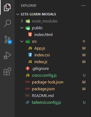
Much cleaner (and lighter)!
We'll be working inside of App.js, but for larger projects, you would ideally want to create a separate component for the implementation of the modal.
CRA gives us a file with the boilerplate ready, so let's clean out the code we won't need.
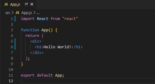
Rid of the unnecessary lines of code
Now let's create our modal components for the Signup and Login content. I'll first create the two modals named SignupModal.js and LoginModal.js. Don't forget to import them!
import SignupModal from "./SignupModal";
import LoginModal from "./LoginModal";

function App() {
  return (
    <div>
      <SignupModal/>
      <LoginModal/>
    </div>
  );
};
In order to implement the functionality of the modals (ie, the open and close feature), we will use React's very own useState hook. Go ahead and import it at the top of the file.
import React, {useState} from "react";
// imports of Signup and Login modals

function App() {

    // Webpage logic

}
We'll set up some state for that to keep track of whether the modals are open or closed. By default, it'll be set to false (ie, closed). Inside of our App.js, we'll also add two buttons, Signup and Login, which contain an onClick method that updates the state to true, thereby launching the pop-up. Additionally, we have to pass that state as a prop to our components, which will allow them to be active only if the state is true (ie, open)
function App() {
  const [signupModalOpen, setSignupModalOpen] = useState(false);
  const [loginModalOpen, setLoginModalOpen] = useState(false);
  return (
    <div>
        <div>
          <button onClick={() => setSignupModalOpen(true)}>
            Signup
          </button>
          <button onClick={() => setLoginModalOpen(true)}>
            Login
          </button>
        </div>
      <SignupModal
        modalOpen={signupModalOpen}
        closeModal={() => setSignupModalOpen(false)}
      />
      <LoginModal
        modalOpen={loginModalOpen}
        closeModal={() => setLoginModalOpen(false)}
      />
    </div>
  );
}
Inside the component, we'll pass a simple check on the value of the state, allowing it to run only if the state is true. Additionally, let's add the close button as well here, and set an onClick method to call a function closeModal which will set the modals state to false. Don't forget to destructure the props passed in the modal!
function LoginModal({ modalOpen, closeModal }) {  //Same for SignupModal.js
  if (!modalOpen) return null;

  return(
    <div>
        <h1>This is a Modal!</h1>
    </div>

  )
Done? Nice work, now let's get our modal looking like an actual popup 🎨
3. Apply styling with Tailwind 🖌
We're close to implementing the actual functionality of our modals, but before that, let's make them look more appealing to the eyes, which conversely makes them easier to work with!
Remember, you don't necessarily have to recreate exactly what's being styled here, so here's your chance to be creative!
First, let's make our static page on which our pop-up will work. I'll be adding some text and two buttons, for Signup and Login.
function App() {
  const [signupModalOpen, setSignupModalOpen] = useState(false);
  const [loginModalOpen, setLoginModalOpen] = useState(false);
  return (
      <div>
        <h1>Chitter</h1>
        <div>
          <h1>See what's popping in your forest 🥜</h1>
          <h1>Join Chitter now.</h1>
        </div>

        <div>
          <button onClick={() => setSignupModalOpen(true)}>
            Signup
          </button>
          <button onClick={() => setLoginModalOpen(true)}>
            Login
          </button>
        </div>
      <SignupModal
        modalOpen={signupModalOpen}
        closeModal={() => setSignupModalOpen(false)}
      />
      <LoginModal
        modalOpen={loginModalOpen}
        closeModal={() => setLoginModalOpen(false)}
      />
    </div>
  );
}
Secondly, let's add some input fields for our Signup/Login pop-ups, and a Signup/Login and Close button
// Username input not required for LoginModal.js
function SignupModal({ modalOpen, closeModal }) {
  if (!modalOpen) return null;

  return (
    <div>
      <div>
        <div>
          <h3>Login</h3>
        </div>
        <div>
          <input type="text" placeholder="Enter email"/>
        </div>
        <div>
          <input type="text" placeholder="Enter username"/>
        </div>
        <div>
          <input type="password" placeholder="Enter password"/>
        </div>
        <div>
          <button>
            <h3>Login</h3>
          </button>
          <button onClick={closeModal}>
            <h3>Close</h3>
          </button>
        </div>
      </div>
    </div>
  );
}
Now quickly I'll apply the styles for both the landing page and the modals
function App() {
  const [signupModalOpen, setSignupModalOpen] = useState(false);
  const [loginModalOpen, setLoginModalOpen] = useState(false);
  return (
    <div className="flex flex-col justify-center items-center min-h-screen min-w-full">
      <h1 className="flex justify-center items-center text-7xl">Chitter</h1>
      <div className="flex flex-col">
        <h1 className="flex justify-center items-center text-3xl mt-4 ">
          See what's popping in your forest 🥜
        </h1>
        <h1 className="flex justify-center items-center text-3xl font-bold mt-20">
          Join Chitter now.
        </h1>
      </div>

      <div className="flex mt-20 flex-col">
        <button
          className="my-4 mx-auto py-2 px-4 flex justify-center flex-row border-2 border-green-600 rounded-full cursor-pointer hover:bg-green-400 duration-200 w-72 font-medium text-xl"
          onClick={() => setLoginModalOpen(true)}>
          Login
        </button>
        <button
          className="my-4 mx-auto py-2 px-4 flex justify-center flex-row bg-green-500 rounded-full cursor-pointer hover:bg-green-600 duration-200 w-72 font-medium text-xl"
          onClick={() => setTimeout(setSignupModalOpen(true), 3000)}>
          Signup
        </button>
        <SignupModal
          modalOpen={signupModalOpen}
          closeModal={() => setSignupModalOpen(false)}
        />
        <LoginModal
          modalOpen={loginModalOpen}
          closeModal={() => setLoginModalOpen(false)}
        />
      </div>
    </div>
  );
}
<div className="bg-gray-500 bg-opacity-70 absolute top-0 left-0 right-0 bottom-0 flex justify-center items-center">
      <div className="bg-white px-10 py-4 rounded-3xl w-96 h-82">
        <div className="-mt-2 mb-8 text-3xl font-bold mx-auto">
          <h3 className="px-24">Signup</h3>
        </div>
        <div className="mt-4 text-2xl py-2 px-2 border-gray-600 border-2 rounded-xl outline-none">
          <input
            className="outline-none"
            type="text"
            name=""
            id=""
            placeholder="Enter email"
          />
        </div>
        <div className="my-4 text-2xl py-2 px-2 border-gray-600 border-2 rounded-xl outline-none">
          <input
            className="outline-none"
            type="text"
            name=""
            id=""
            placeholder="Enter username"
          />
        </div>
        <div className="my-4 text-2xl py-2 px-2 border-gray-600 border-2 rounded-xl outline-none">
          <input
            className="outline-none"
            type="password"
            name=""
            id=""
            placeholder="Enter password"
          />
        </div>
        <div className="mt-12 flex justify-around">
          <button className="py-2 px-4 flex justify-center flex-row bg-green-500 rounded-full cursor-pointer hover:bg-green-600 duration-200 w-36">
            <h3 className="text-xl font-normal">Signup</h3>
          </button>
          <button
            className="py-2 px-4 flex justify-center flex-row border-2 border-red-600 rounded-full cursor-pointer hover:bg-red-400 duration-200 w-36"
            onClick={close}>
            <h3 className="text-xl font-normal">Close</h3>
          </button>
        </div>
      </div>
    </div>
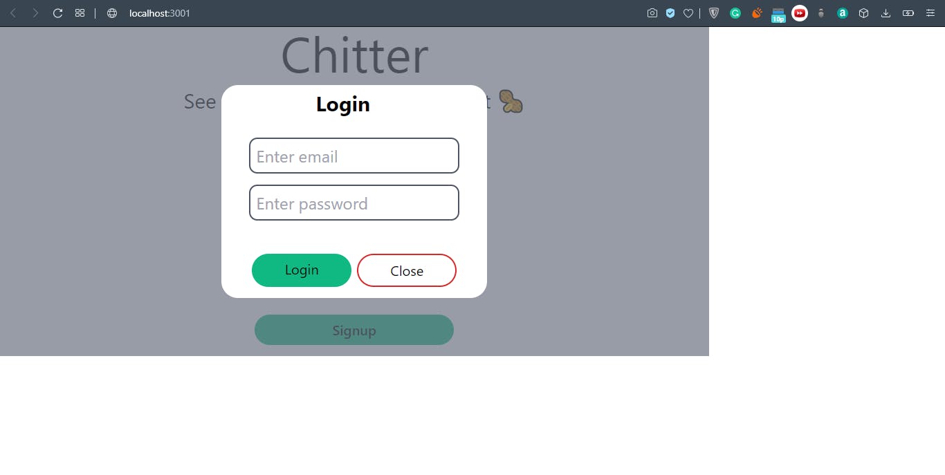
End result should look similar to this:
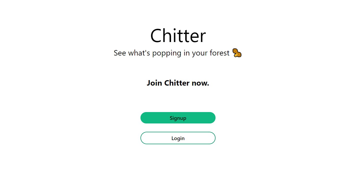
Landing Page
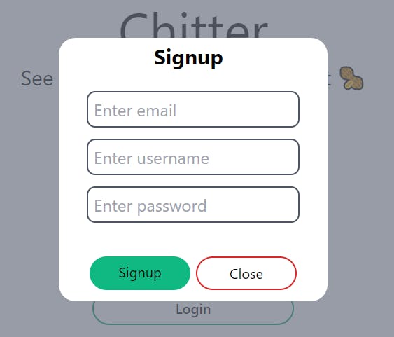
Signup Modal (Login should look similar to this)
Done? Excellent! Now let's make our modals work like they're supposed to!🔥
4. Implement functionality using React Portal ⚛
If you've made it till here, you'll notice that the pop-up works like a charm! On clicking the Signup/Login button, you're shown a pop-up prompting you to enter the required details, and you have the ability to also close the popup using the Close button.
Great then! So why this additional section?
Before we dive into that, let's tweak our styling just a bit. Inside your App.js file, change the width and height of div to a smaller size(I've set them to 75%), and include a class of relative, which is the same as setting the position of our main div as relative.
function App() {
  const [signupModalOpen, setSignupModalOpen] = useState(false);
  const [loginModalOpen, setLoginModalOpen] = useState(false);
  return (
    <div className="flex flex-col justify-center items-center h-3/4 w-3/4 relative">

     {
         //...
     }
  )
}
Do you see what happened? We changed the size of the parent div, but that has also affected the child modal components. Since the modal's height and width are inherited from the parent div, the child component is now limited to the parent div's boundaries, which goes against our pop-up's intention of being rendered on top of all other elements.
Surprise surprise, the devs behind React had clearly thought of this beforehand. To solve this problem, we'll be using Portal with React-DOM. We'll instruct React to render our modals in a separate root element (different from the default root), thereby bypassing the parent divs styling rules and rendering our modals normally like before.
First, let's create our second root div for our modals. Inside of index.html, add this line below the root div:
<!DOCTYPE html>
<html lang="en">
  <head>
    <title>React App</title>
  </head>
  <body>
    <div id="root"></div>
    <div id="modal"></div>  //This is the additional line required to implement Portal
  </body>
</html>
Now inside our SignupModal.js andLoginModal.js file, let's import ReactDom and implement Portal using createPortal. This method takes in two parameters: The div that we want to render, and the location to render the div to (ie, the modal root)
import React from "react";
import ReactDom from "react-dom";    //Importing ReactDom

function SignupModal({ modalOpen, closeModal }) {
  if (!modalOpen) return null;

  return ReactDom.createPortal(    //Implementing portal
    <div className="bg-gray-500 bg-opacity-70 absolute top-0 left-0 right-0 bottom-0 flex justify-center items-center">
      <div className="bg-white px-10 py-4 rounded-3xl w-96 h-82">
        <div className="-mt-2 mb-8 text-3xl font-bold mx-auto">
          <h3 className="px-24">Signup</h3>
        </div>
        <div className="mt-4 text-2xl py-2 px-2 border-gray-600 border-2 rounded-xl outline-none">
          <input
            className="outline-none"
            type="text"
            name=""
            id=""
            placeholder="Enter email"
          />
        </div>
        <div className="mt-4 text-2xl py-2 px-2 border-gray-600 border-2 rounded-xl outline-none">
          <input
            className="outline-none"
            type="text"
            name=""
            id=""
            placeholder="Enter username"
          />
        </div>
        <div className="my-4 text-2xl py-2 px-2 border-gray-600 border-2 rounded-xl outline-none">
          <input
            className="outline-none"
            type="password"
            name=""
            id=""
            placeholder="Enter password"
          />
        </div>
        <div className="mt-12 flex justify-around">
          <button className="py-2 px-4 flex justify-center flex-row bg-green-500 rounded-full cursor-pointer hover:bg-green-600 duration-200 w-36">
            <h3 className="text-xl font-normal">Signup</h3>
          </button>
          <button
            className="py-2 px-4 flex justify-center flex-row border-2 border-red-600 rounded-full cursor-pointer hover:bg-red-400 duration-200 w-36 "
            onClick={closeModal}>
            <h3 className="text-xl font-normal">Close</h3>
          </button>
        </div>
      </div>
    </div>,

    document.getElementById("modal")    //Assign the root div to render to
  );
}
Now if you look at the rendered website, you can see it's back to normal. Additionally, if you were to open the inspect element inside chrome, you can see two divs. The root div contains all the content of our site and the modal div contains our actual modals.
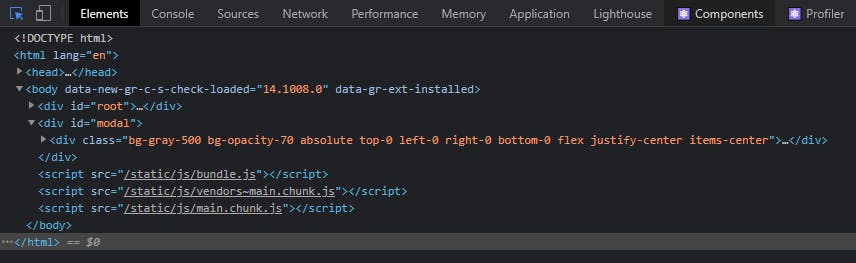
This is because our child components, aka modals are children of our App component, they are still able to render outside of the parent component using portals. Another benefit of using Portal is that any events fired are still propagated to the parent divs, even though they are being rendered in a different root div. Similarly, React is still able to control the lifecycle of the child components.
Conclusion 🏁
Now you've hopefully learned how to create a pop-up for your own website, and you've also learned how Portals work, how they allow rendering of child components outside of their parents, and why they're super beneficial for such applications.
Wrapping up! 😊
Hope you enjoyed reading my first edition of "Let's Learn". This will be the first of many editions as I teach you about concepts that seem scary at first but are super cool in their workings. Definetly give your reaction and feedback, and of course, share this article with someone who needs to read this!
- For similar but short content, follow me over at Twitter 🐤 here.
- Check out what I'm currently working on over at Github 🐱 here
Till next time, take care and cheers!🥂